Researching and analyising Graphic Design which either employs the use of camera technology, or uses design to highlight specific camera- related topics- both through type and image.


A project by designer Drew Marshall, in which he was asked to develop a campaign for the 2011 Filmed by Bike festival (a showing of bike-themed films). In the posters he cleverly combines elements of bikes to construct his typeface- but my personal favourite is the small camera at the bottom right-hand corner. Good, simple idea- communicates easily to the audience.


A project by Norweigan Designer, Krister Lima in which she was asked to design a film magazine- one for a younger, and one for an older audience. Really like the bold illustrative style of the recorder and the minimal colours used- quite striking.


An identity and branding brief by Todd Asmus, comissioned by Wisconsin Photojournalist, Harlen Persinger.I really like the simple and recognisable elements that Todd has used in his design, that are instantly recognisable but still look unique and professional. The colour green was chosen to reflect Harlen's regular pursuits in landscape and agricultural Photography.


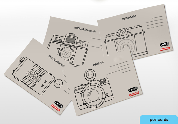
A 2008 student project by Graphic Designer Sean Ball. In his project he chose several Lomo Camera product designs and re-invented the packaging, to showcase the product and give a detailed description of the item simply from the packaging alone. Good designs- consistent logos and layouts ensure a good product range.


I love these Infographic Designs, celebrating 45 years of the Kodak Instimatic Camera, created by Brazilian Designer, Manuel Panameño. Brilliant use of colour and consisent, and impressive vector designs. I LOVE the camera timeline. I'd really like to go on to design a range of print-based works like these. Really inspiring stuff.


Branding design for Lomography cameras by Designer Zina Falewich. Not actually too much of a fan of these designs- maybe a little too much going on- too much colour and not simple enough, although I do like the style of Illustration used to create the camera images. I much prefer the simple line drawings, but perhaps they could benefit from a simple spot colour to ensure that they stood out and looked as exciting as the product in which they are trying to promote.


Last but certainly not least- I LOVE these double exposure portraits by Brighton-University Graphic Design student, Dan Mountford- and I'm not the only one. Dan was recently confronted by Gestalen to have his images on the cover of one of their new publications, 'The Modernist' which highlights recent-day culture in art and design of utilising traditional methods in a Modern approach.
Dan uses images of his hometown of Brighton combined with simple, yet bold portriats for these fantastic images. Simply done but incredibly effective.
No comments:
Post a Comment